Victoria + Albert
Brand Research, Brand Identity, Stationary
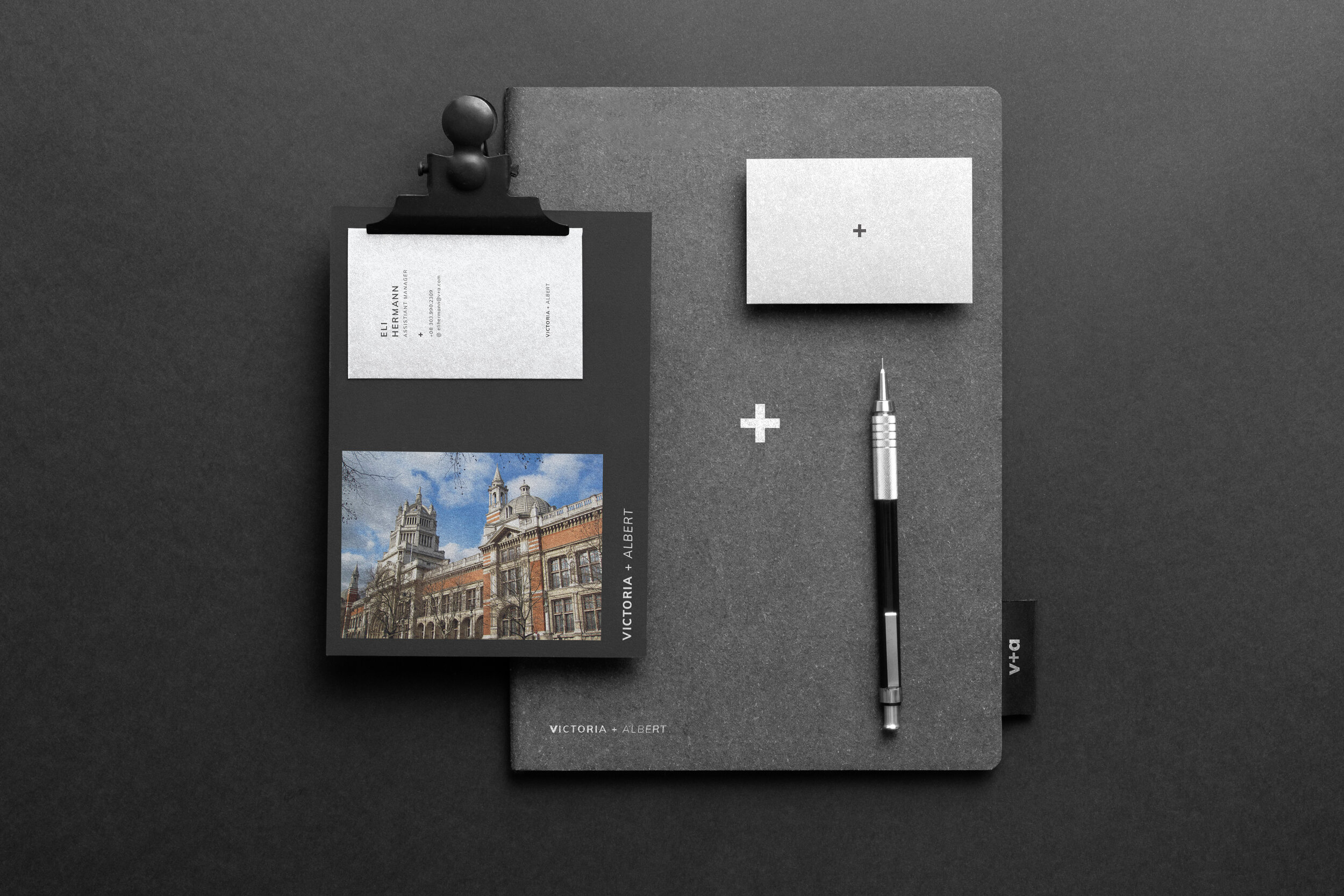
The Victoria and Albert museum is a place that houses immaculate collections of art and design. The Victorian architecture only elevates these wonderful pieces of work. However, the magnificent relationship that the artwork and the architecture have is very special and I didn't want to disrupt that. However, a brand that has been influenced by that Victorian style could give the museum a very cliche and dated feel, while also limiting the work to more classical style art rather than contemporary pieces and collections.
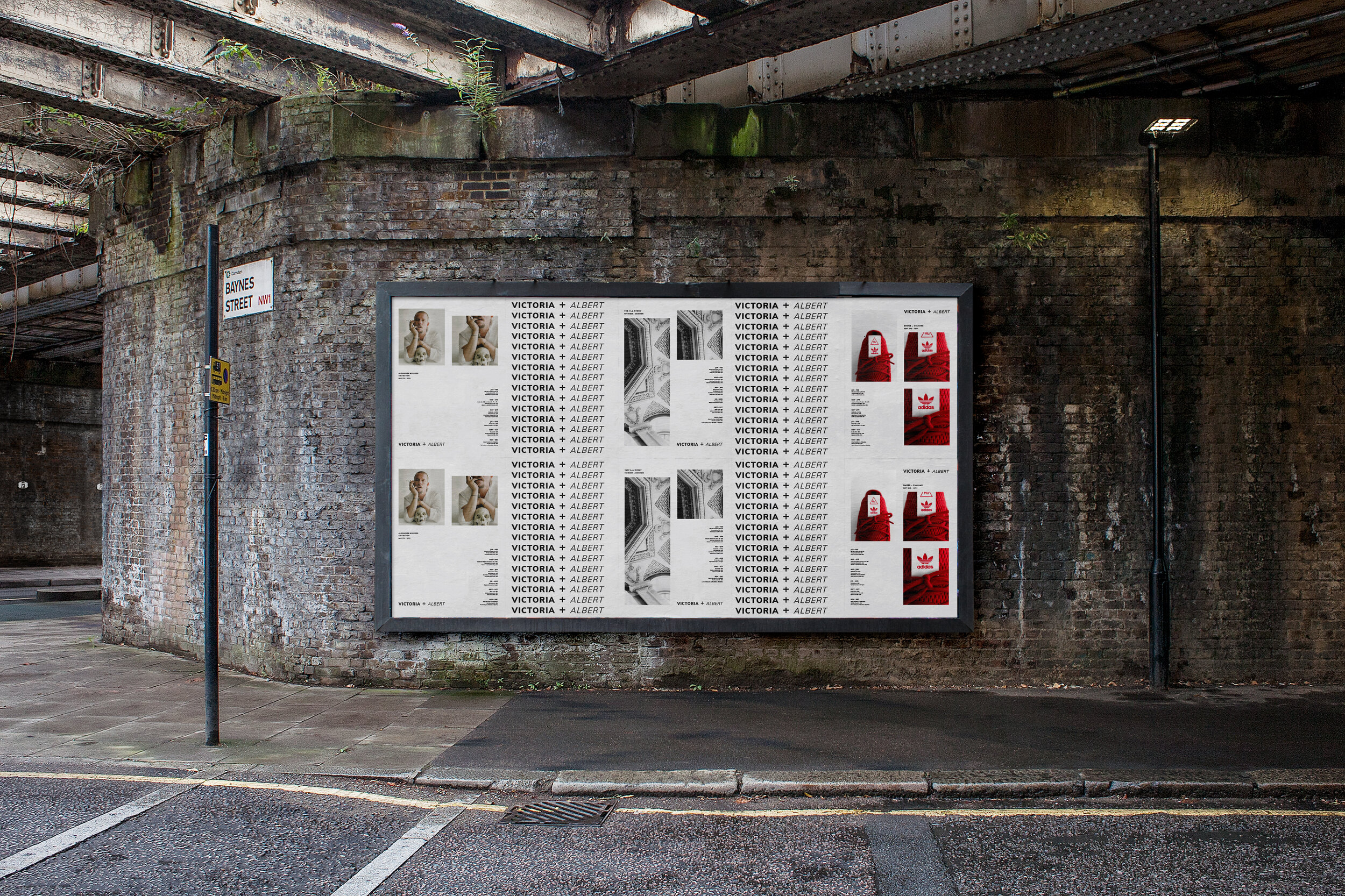
Some of my goals while creating this brand were to; create a smoother transition from the old architecture to more of a modern age. While at the same time, allowing for contemporary and classical collections to live in harmony in the museum.


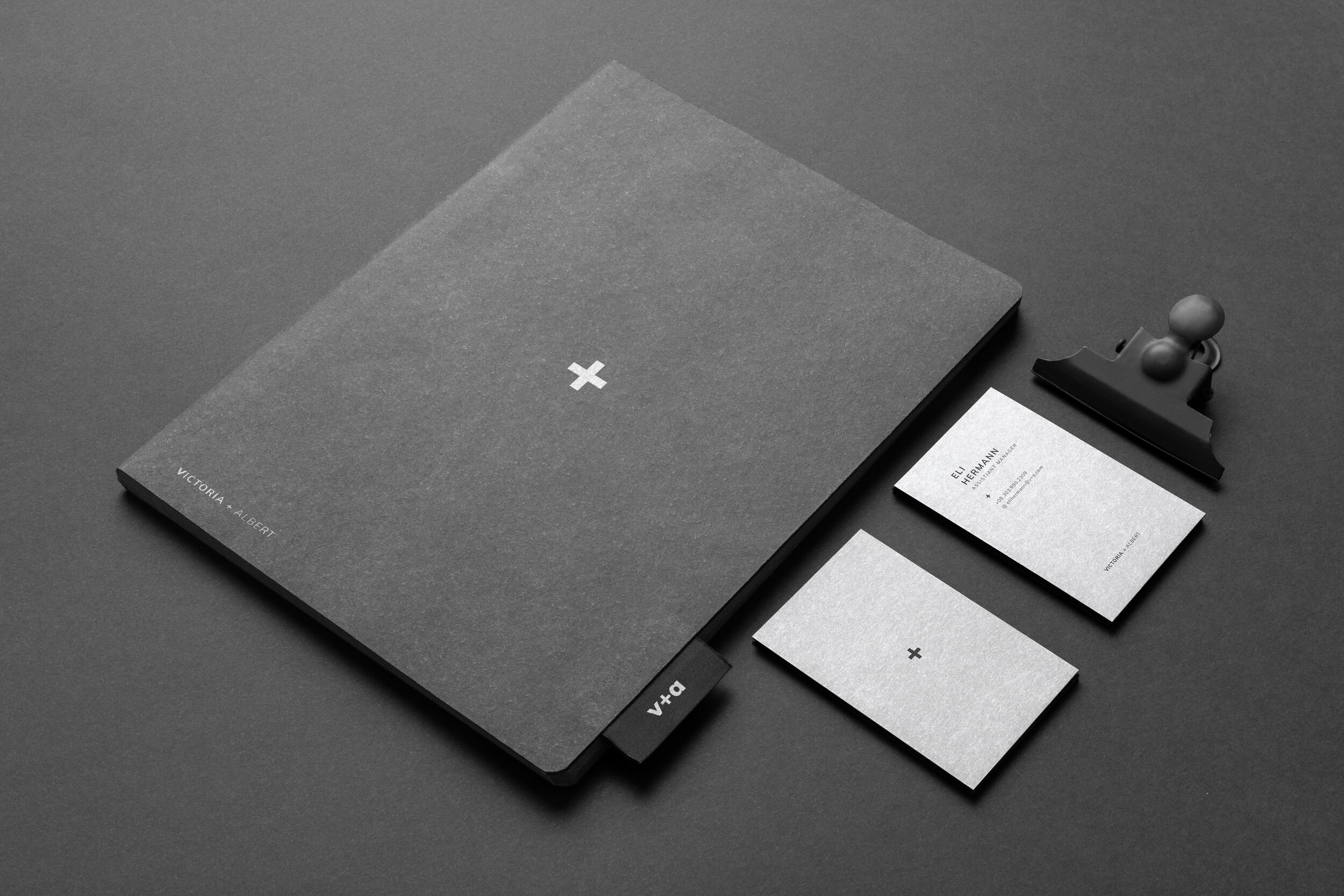
I have created a very clean, chic, and blank slate brand to house any type of artwork. It has a timeless feel, while also being very fluid from classical to more contemporary pieces. Keeping the color palette very neutral helps avoid clashing color schemes and allows the artwork to have it's moment to shine. After all the goal of a museum is to elevate and display artists work in a dignified way, but also keeping the integrity of the artist.
The typeface is friendly and inviting, but has been treated in a very sophisticated way. Because the typeface has been designed so well, it also is timeless like a lot of the art being shown in the museum. It doesn't have a time period or trend associated with it which also allows it to move seamlessly from classical pieces to more modern collections.
The entire brand has been built to not steal the spotlight from the architecture, installations, collections, or exhibits. Rather it is to be used to elevate and bring a more modern feel while capturing the timeless quality that many of the pieces in the museum have.


